Philippe Apeloig
Graphic Designer
Conducted by Christian Larsen on November 12-14, 2008 at Philippe Apeloig's studio, 41, rue La Fayette, Paris, France
In this interview, Philippe Apeloig comments upon his education, career, and design practice. He describes in detail how he created a series of posters for Fête du Livre in Aix-en-Provence, beginning with "L'Afrique du Sud au Présent" in 1997. He also discusses his designs for the logo of the Musée d'art et d'histoire du judaïsme, and the 2008 Type Director's Club Annual. His account highlights the dyanmics of client-designer relationships, and the importance of design’s cultural meanings in national and international contexts.including the Chevalier de l 'Ordre des Arts et des Lettres in 2011.
Transcript length: 22 pages.
[The interview began with Philippe Apeloig discussing posters he created for Fête du Livre. Tino Grass was also present.]
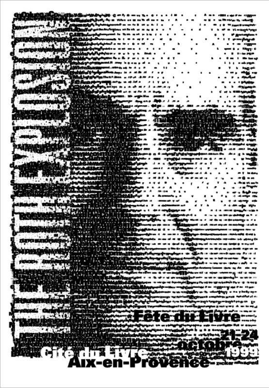
Philippe Apeloig (PA): I'll explain to you the archive and what happened with this poster and you’ll see the final one. It’s at the end. Just for you as a story. So this is a literature festival that happens every year in Aix-en Provence in the south of France. It’s about foreign literature—I started to work with them in 1997 with the topic about South African literature. The year after it was about the Caribbean literature and the third time it was in 1999 they invited only one writer which was Philip Roth. Philip Roth brought this title, “The Roth Explosion.” It was referring to his prolific career. He wanted to have his face, this portrait, on the poster, because the two posters I did before they were only done with typography. So the portrait was made by a photographer, Nancy Crampton. She gave us this photo but I had no idea what I could do with it.
Christian Larsen (CL): It was Roth’s idea to use a portrait?
PA: Yes. He wanted to have his portrait. As far as I know. I was quite embarrassed to start with a portrait. I didn’t know what I could do with it. My idea at the beginning was to do something with typography. So I started like that. So then you can move on. This is not really the request. Those are examples of what I did only with typography. That’s what I wanted to do. I wanted to keep going with the series of the two previous posters that I did which were South African Literature and Caribbean. But I had to use the photo so I start to see what I can do with the portrait of Philip Roth. I wanted to make it really graphic. I took just a detail of the portrait, and I used it pixelated. I hope I have the photo somewhere. This is really the way I started to do in term of design. At that point, I tried to put it on an angle, I tried only to take only one detail of his portrait.
CL: It wasn’t working.
PA: No I think, it was too hard, I think the detail was too close. And it’s hard to recognize him really, and it was not a great idea to do that. All those sketches were how to frame his portrait, mostly. And how to find the right angle.
CL: The typography experiment started before the portrait–the portrait came from the client?
Philippe Apeloig, "The Roth Explosion," Fête du livre, Aix-en-Provence, 1999. Poster, 118 x 175 cm. © Design Philippe Apeloig.
PA: Yes.
CL: From Roth or were you working with an intermediary?
PA: No, the organizer, her name is Annie Terrier, meets all these writers and she convinces them to come to Aix-en-Provence. But what I would like to explain to you is that I read the books, I tried to be in contact with the world of the writer. I knew about Philip Roth, because I read some of his book before that. I realized he was obsessional in many ways. I wanted to express that in the poster. That’s the idea of accumulating type. And bringing all the typography in this portrait would be the main idea. That everything is in his mind, is in his head in some way. At the beginning I started with some text, and after I used the title of his books which are repeating several times. Behind, I keep the structure of the pixelated image of this portrait to place the type because without this structure it was a little bit cloudy? Then you can see for example that between these two sketches I had some problem to incorporate the title because it was flat if I incorporated it like this, so I decided that even the title should be made in the same technique. Everything is made, except for those information at the bottom, by accumulation of type. Of course there was a lot of tests, because they [the letters] were placed one by one. You know with the size. You see here? That’s pretty much the structure I kept below.
CL: It’s more horizontal.
PA: Yeah it’s more horizontal. Okay. But there was a lot of tests of framing. I didn’t know where to put it, more to the left, more to the right, and how to make the title really bold.
CL: Yeah, how to make it pop out from the rest of the frame.
PA: To make it really stand out. And also what you see at the end, after, we did a gradation.
CL: You did a fade.
PA: Yes. So there was a lot of tests of the frame. At the end, this disappears here. Many details were organized. Keep this here. The beginning. But you see just one poster like that it demands a lot of tests and some adjustments in the proportion and all these things. I was sure at the beginning to do something very typographic, very pure. I do not regret anything. And this is the beginning of how I started. You can see the transition between the pixelated image of Philip Roth and the incorporation of the type. So this can be placed here. It’s a very long process. Here for example you see how the portrait was built without the horizontal structure. And its floating and its hard at first to see him, to recognize him, to see that it’s a portrait, it’s too abstract.
CL: How did you refine the resolution and get it to a point that he was more legible?
PA: I think as I remember I printed it at full scale and just tried to see it from a distance. If it would be possible to recognize him and to still read the title. And these are the tests for the density of type the silent type for the title. Here for example you see some bad takes. It’s not a bad typography anymore, it’s just like a screen. You don’t see its made of letters. And just for the story and all the detail. There was a big discussion about the color of the poster. The final poster is red. It was printed in France just at that period that I moved to New York. So I sent the files to a silkscreen printer. And what happened is that they couldn’t register all the type. It was a disaster. You never saw those posters. I think I kept a few copies of the red. They couldn’t register. They were unreadable. I don’t know how they figured it out. The title “The Roth Explosion” was absolutely unreadable. So that’s the reason why we printed it correctly one time when I was in Paris. We printed it in these two versions, one in white and one in grey silver. I prefer the white one. I have very few copies of that poster. But he loved the red thing, he was satisfied because he saw his portrait all over the city in red.
CL: So all the black was red, red-on-white?
PA: No. The black was black, but the background was red.
CL: The background was red. So this is not the final poster then.
PA: That’s the final poster.
CL: What about the red?
PA: The red I never show it because it was badly printed. So I reprint it.
CL: Oh okay.
PA: That’s the thing you should know from me. The way it works. It is a nightmare to have the right printer. What I’m doing now I always save in the budget a certain amount of money that allows me to print a few copies which are perfect, perfectly done, in silkscreen, with no logos, at a printer that I know, with the right color. That’s what I call the limited edition of my work. I always print a limited edition which is never more than fifty copies, usually it's more about thirty or forty copies.
Tino Grass (TG): Forty.

Philippe Apeloig, V.S. Naipaul: L'énigme de l'arrivée, Fête du livre, Aix-en-Provence, 2002. Poster, 118 x 175 cm. © Design Philippe Apeloig.
PA: Forty copies of the poster. That’s really what I have. The reason why I’m doing that is because it’s often too much fighting with the client to go for quality. So now, let me talk to you about the next poster that we have. It’s not in chronological order but it doesn’t matter, its just because they were classified altogether. It was for another year, it’s the Fête du Livre devoted to V.S. Naipaul. I have to explain to you that V.S. Naipaul was born in Trinidad but from an Indian family. He has a literature Nobel Prize. The most famous book that he wrote is called The Enigma of the Arrival. It’s a lot about where your roots are. He lives in England now. He’s looking for his roots in some way, and he doesn’t know where we’re going. The Enigma of the Arrival. That’s pretty much what it is. I thought it would have been really nice to use his portrait. Because after what happened for the Philip Roth poster, all the writers who were invited wanted their portrait. All of them. So that’s what is going on now. I wanted to created a photo-collage, overlapping his portrait with an image of a tree trunk because the tree trunk is really like the memory, the history, the time, etc. That was the main idea. These are all my photos, I did all those photos in California. They’re not that great pictures. Those are some photos that I took of tree trunks in America. That’s the portrait of him. I started with the screen. I guess I wanted to create something to reflect the idea of the enigma, something enigmatic with different screens. That was the main idea, from the beginning, to create a kind of crescendo of screens. I tried it in different ways. I think here there’s really something enigmatic because of the tree.
CL: Right. There’s—a sheet of paper doesn’t have the same concept as the rings of a tree.
PA: I try to incorporate some detail in there of his Indian roots. The problem was it looked as if he was a shooting target. It was very difficult to find where to place the center of the tree. I had difficulties with the typography. It reflects the Indian roots, but it doesn’t tell anything. I think it was not—
TG: It’s too graphic.
PA: Yeah its too graphic for what it is. There’s no human dimension. These are tests, with screens. There’s a lot of those, and they’re not all very good. These are not really in order, but you can see at least, I decided to put the center of the tree right in his eyes and then the type was never really well made for that poster—
TG: But I think it’s the best the structure of the skin—
PA: Yes. And the final poster. After it was difficult to find the right color for the background, kind of saffron, curry. The poster, you saw it, Tino, I don’t think it was nicely printed. It’s unfortunate because the type its disappearing in the image. That was the idea with the arrow or the gradations. Maybe we should keep going with the same plan and look at the South Africa, for example? Tino—
TG: I’m not sure. There.
PA: And it’s bizarre because I kept some letters. It was the first poster I designed for them. What happened is when they gave me the topic I didn’t know anything about South Africa, nor South African writers. You have to know it happened in 1997 so it was just a few years after the abolition of the apartheid. At that time it was heavy all that was happening in South Africa. My vision of their culture was mostly influenced by what comes from the street, like graffiti, something handmade. What I did was a lot of calligraphy like that. That was my first idea. The title should be handmade like somebody would do that in the street. Kind of a trashy look in some ways. I came up with this project and I wanted this mosaic of colors from the earth. With all these handwritings. This was my main idea. I worked so much on this and I was happy too about the idea but it was rejected. Let me see. There’s more. I still like them in some way. No?
CL: Yeah.

Philippe Apeloig, "L'Afrique du Sud au Présent," Fête du livre, Aix-en-Provence, 1997. Poster, 118 x 175 cm. © Design Philippe Apeloig.
PA: What you have to know I was going quite often to New York. I went to New York and I don’t remember what time before the summer and I had to redo the poster. There I saw, maybe at the MoMA [Museum of Modern Art] the work of Ellsworth Kelly with all these stripes. It’s mostly representing water, I don’t know its based on water from when he was in Paris actually as far as I remember he did a lot of abstract paintings looking at the water.
CL: Is that the one that you show in the sketches?
PA: Yes. That’s the one. That was important for me. All of this work. Because I started an approach which is a kind of Art Deco looking. And I always wanted to have the color of the earth. I can tell that what came out of this poster is the fact to use only two colors, only the black and the white and then another color. This is maybe one of the very early sketches. What I decided when I saw his stripes, I said to myself maybe I can incorporate the stripes with my handwriting design to refer to South African textiles. You can see all the possibilities that came from that. I was at that step on the stair when I decided to do something totally different. I said to myself 'so let’s think about what is South Africa. Black people, white people, let’s divide the poster into two equivalent parts. That was a major decision that I took. Then, regarding the stripes, maybe this is the transition, it said “South Africa Today.” Yeah this is the transition because those stripes are mechanical, and those are much more inspired by Ellsworth Kelly. They are not mechanical, they are angled in different ways. That became lively because suddenly the stripes look like the mixture between the two communities. They mixed.
CL: Yeah I was going to say it’s more organic, more natural—
PA: It is. Because the type disappears behind. It’s like a weaving again. And also it’s like books on the shelf. I thought it was the main idea. You look at these steps, that one, and then this one. And then you have really the way the poster evolved. And then after it was easy for me to place the type as you can see here. That’s pretty much the final poster. This is one of the best posters I ever designed. Luckily that’s the way we became friends with the client. Because she was so happy that I was capable to move forward, compared to the first project. It was so tough with the first project. Even today when I’m working with her she says, “Remember what you did for the South Africa—you must start it from zero.” But I don’t have that energy all the time. I must tell you for this poster definitely it was because I saw the work of Ellsworth Kelly at the MoMA—otherwise it wouldn’t ever happen. And maybe it was because I was abroad, quiet, and able to focus on the topic. And that’s what I miss sometimes because there is so much pressure. It’s difficult to have your mind fresh and to find the exact poster.
TG: You aren’t going to stop the Salman Rushdie poster—
PA: Yeah the last one is Salman Rushdie. I don’t know if it’s the best one. Probably not but eh—
TG: No that’s—
PA: Yeah, it’s okay. Let’s have a look at Oé. The thing is today I know the Fête du Livre will be about one writer. So we have Toni Morrison. Do we have the sketches of Toni Morrison somewhere? That would be great. So continuing, after the African, Caribbean, it’s just been in celebration of one writer.
TG: Not only, in 2004 it was about America. About the—
PA: Oh right, with the red and white—of course. The festival is always about politics in some ways. They bring a topic that obliges you to think, to take a position. You have great lectures in an interesting atmosphere because the city has a huge library and universities so it’s full of students, and it’s open, it’s free. When one writer is invited there’s a group of writers who are invited around him—
CL: Mmm hmm a whole panel.
PA: A whole panel of people, critics, journalists, writers who talk about this work. So let’s have a look at—it’s not in chronological order. Because now we are in 2005, 2006? This is Kenzoburo Oé who is a Japanese writer. Nobel prize. His literature is well known especially because he wrote about his family and about his son. He has one son who is handicap. He also talks about the war and the nuclear bomb, Hiroshima and Nagasaki. That’s the reason why he came with this title. “Je suis de nouveau un homme.” I’m once again a man. It’s about surviving so many things, and to come back with a humanistic dimension. What I tried was to show him as a Japanese writer. But the problem, he doesn’t consider himself as a Japanese. He wants to have a really—
CL: International—
PA: Better to say universal. He doesn’t want to appear like a traditional Japanese. But that’s the way I started. I was inspired by the way Japanese read vertically, to have banner text, like banners, things like this. And you can see through this project now how many steps I went through. If I do think like this, yes, it’s because I’m hesitating so much. I can tell. I don’t know where I’m going. That’s one of my main trouble I would say. Here, again I’m always trying to do something with the photography because the portrait photographs for press are not always interesting to use as a poster. I don’t know how did I came with this idea to create a mosaic of tiny squares made of the three primary colors, something that unifies but also its spread over to design his portrait. It’s pretty much similar with the Philip Roth made out of letters. I started to place the dots one by one. You understand why I like Georges Seurat. You can see it in the progress. It was a nightmare. But I like the idea, because at the end his portrait became like a radiography image of himself. With the red. And it’s vibrant. I still have the idea of those banners for the test. I did the whole portrait. It’s beautiful in some way. I had some problems to put the text. For me if you look at this, I could have done the poster just with very small type. But the client usually doesn't want small type. They prefer big type, to be readable. You can see I didn’t know if it had to be cropped to the right or to the left. It would have been really nice all these dots. Anyways—This is all the sketches. I try to use the vertical direction for the type to refer to Japanese culture. Just for you to know all these projects had been rejected. That’s the reason why I had to look for something else. And I was quite happy with the idea. Also with the fact to have the type vertical like that. I don’t know exactly which one, but the idea was very pleasant.
CL: So at what point did you actually think you found the idea, you submitted to the client, they rejected? With the color screen?
PA: I think with the color.
CL: Yeah that seemed pretty resolved to me.

Philippe Apeloig, Kenzaburô Ôé: Je suis de nouveau un homme, Fête du livre, Aix-en-Provence, 2006. Poster, 118 x 175 cm. © Design Philippe Apeloig.
PA: Yes. And it was rejected. So I start again. I thought about his name O-E. Because this could be like a Japanese character. If I go for the abstraction. Especially because there are two accents I try to do something with this in mind that looks like a Japanese stencil, a Japanese signature. And still I didn’t know how to incorporate his portrait. That was not clear. I thought the “OÉ” symbol would give me a structure to place the type inside this sign. Color also was fading, you know having red is too easy! I start to use other colors to make the poster more dramatic. I try to have a structure to have him in the back. But the problem is when you look at all these designs, there’s no unity, when I look at them, it’s spreading away.
TG: All the portrait in the background.
PA: Yeah nothing is attached together and everything is lost at the end. You can’t even read it, there’s no choice about the proportion, why this empty space here—nothing makes sense, in terms of proportion and in terms of meaning. The only good idea maybe was even before, when the letter is not cut. Exactly. The only thing that I started to do was to make it more abstract at the time. You see the difference between that and that. Because then the space circulate in the letters and it becomes more abstract. It becomes like something that could come from another alphabet. You see that? Okay. It’s bizarre like that Tino because that’s the same idea. With the vision. I wanted to show the writer and to give a vision of what is written. But again the problem with all these things, it’s spreading, how do you say, disperser? Spreading apart that’s the way you say in English?
CL: Disperse.
PA: I hope I have a better sketch before we go to—I don’t know, at one point what happened between what we saw before and this idea. But first of all, because I had this problem of disperse, so I say I have to group all the type in the big type. To bring all the information: his first name, the title, Fête du Livre, everything inside the big letters so then you can see everything as a Japanese symbol. I placed his portrait behind and to look for the right color where he is astonishing. There’s no red anymore in the poster to refer to Japan, with this kind of blue-green. His portrait on Photoshop is made I don’t know how to explain that but you don’t have the screen, you don’t have too much detail of his portrait anymore.
TG: And you really reduced—
PA: Yes, and you can see between the two when I cut the letters here it’s even more dynamic because there’s something circulating otherwise it doesn’t circulate there. I thought that only his portrait is flat. Because he tells “Je suis de nouveau un homme” [I’m once again a man], it means there are several steps in life to recover, to come back, to what he is, who he is right now. Evolution. I try to find the steps by color or gradation. Because he’s a hurt man, I should express the pain with torn paper. And that was the idea. I tried many many tests. I saw that one torn was not enough. I should do three times to express the feeling of time. And with the gradation. But when I arrived to that I think those white lines were too extreme, it just killed the whole composition. You can see for example they are not the same here. Should I leave the dark coming in or not, it was difficult to make it clear. All those sketches. I think it’s one of the best posters of this whole series of writers. I received an award from where was that? Hong Kong. There was a—that’s one of the posters that the MoMA rejected, I don’t know why, because I think it’s a good poster.
CL: I think it helps to hear the phases of going through it and working through it. I think for Paola [Antonelli, MoMA architecture and design curator] in particular didn’t care for it.
PA: Who?
CL: Paola. She didn’t really. For some reason it didn’t strike her.
PA: But they took it on the second series. I mean you have it, it’s included now.
CL: It’s there. Yeah it’s there.
PA: Yeah. I’m glad that they kept it because—
CL: But the first trial—
PA: Yeah and they gave me the gold award at the Hong Kong Biennale poster. I think this is a strong one, everything is a well thinking. And when Oé arrived he was blown away.
CL: He was happy.
PA: Yes. It evolved because I took the time also to read, so I know more about who he is. Because at the beginning, Oé, I heard about him. But let’s take Wole Soyinka. We’ll have a look. When I learned that Wole Soyinka would come to Aix, I didn’t know anything about him. I hadn’t heard anything about his literature. This is not the last one, it’s from last year. So I’m always a little bit anxious with designing the Fête du Livre poster.

Philippe Apeloig, Sketches for "Wole Soyinka: La maison et le monde,” Fête du livre, Aix-en-Provence, 2007.

Philippe Apeloig, Sketches for "Wole Soyinka: La maison et le monde,” Fête du livre, Aix-en-Provence, 2007. Poster, 118 x 175 cm. © Design Philippe Apeloig.
PA: For the Soyinka poster, I would like to show the early one. It’s here? These are all the weavings. But before I did the weaving there was some others. We need to classify that. He’s an African writer. He’s a Noble Prize. He lived in Europe as well, especially in England, where he was a student. He’s famous for the theater play that he wrote where he brings in his literature and theater a lot of stories from the people, the tribes who live in Nigeria. Those tribes with their own language, their own roots, own behavior, own stories. Most of the stories they’re not written stories, they are just spoken; transmitted through generations.
CL: Mhm. Oral tradition.
PA: Soyinka brings all those traditions in his literature especially in theater as far as I know. And also those tribes, the most famous one is called the Yoruba and are well known in Africa for their talent in weaving. It's also important to know that Soyinka spent years in jail because he was opposed to the dictator in Nigeria. So he fought against them from England and he went back to his country and they put him in jail for years. It’s an incredible life. Then he came with this title. “La maison et le monde.” It’s home and world, I guess. Home because of the Yoruba, the roots, the people are there, and the world, his message goes universal, humanistic. He lives all over the world, in England but also in France, and that’s why he’s talking also in one of the books called “Les années pagaille” [Ibadan: The Penkelemes Years]. The messy years. In the messy years he explains how he grew up as a student how he was nourished from the European culture, the western culture having this African background and how he made it off in his own world. In some ways it’s a mosaic, even himself he weaves his own life. Is it clear what I’m saying? He’s a weaver, his life is a weaving piece of Western culture, African culture, American culture. That’s the reason it’s le monde, la maison—
CL: Do they come up with these titles or are the titles taken from books?
PA: No I think they come up with the titles.
[Pause.]
PA: I don’t know where to start Christian. Because there are so many possibilities in color. The only thing that I would like to show you is the way how to provide the type. I think this is that part which is extremely interesting to look. Oh here is the beginning. Let’s see. It’s one of the best images. Not because he looks like a prince. The picture was very strong, this portrait. But you know the problem, the fact that it’s very strong, is when you look at that with the type it looks like a CD cover for a jazz concert. You don’t understand that he’s a writer. Or it’s about writing—These African colors.
TG: But the idea of the weaving was from the beginning.
PA: Yes, then you can see. I had this in mind. Of course the weaving is there. But it’s too decoratif.
CL: You mean the client liked it?
PA: Oh! So much. I tried all these, I try immediately with the textile. Here it looks like a jazz musician.
CL: Yeah there it really looks like a jazz poster.
PA: You see? That was not correct.
CL: How careful or controlling are you of presentations to clients? When you’re really satisfied with the idea, you let them in? Or do they sometimes insist on being part of the process to see how it’s coming along. I’m sure every client is different.
PA: The relation that I have with the client that’s my trouble. It’s affective. They’re like—We’re like friends. And everything is so impassioned. I know how strong it is to give this work to them.
[Pause.]
CL: Do you find it’s important to walk them through your thinking process, your production process, you’re hoping that they’re not going to go for the first idea, that they’ll pick the right idea, but that’ it’s important to involve the client.
PA: I think so yeah.
CL: And be totally frank and honest about—
PA: Yeah because sometimes when there’s competition, you send a final image, and they don’t know what is behind. For example Le Havre poster, it was a competition, I send a beautiful piece, they rejected it, and they choose a bad one! You cannot defend your work. I am sure if I showed all the studies that was behind the poster Le Havre it would have been impossible to reject that poster. It’s exactly what it is. And I want to show you, where, here. Here it is. At least this is the beginning. Wole Soyinka, he’s from Nigeria. I didn’t want to have something mathematic, this look jazz because it’s computer looking. I wanted to have it really like handmade. Not something like what the computer does. These are the final things. Let me show you. [flipping through sketches].We did so much in the studio. That’s from the beginning too. All this. Let’s see here. You see there was a lot of hesitation about the type. That came second, because I didn’t know how to place the type until I decided that the type should be weaving too. Here, that’s what we decided to do. I said okay we do that by hand.
CL: This is the first one where you decide to finally weave the paper.
PA: It’s not the final. I did so many, with different color. Also didn’t want to have it regular because I refer to existing textile. With the type it was unreadable. At the beginning I saw that I couldn’t include the type into it. I did it in blue, and that one. And then after I scan it and it was retouched. Here there’s more. I try also with these names, with typography, oh those are all the tests. Just I saw at the beginning it was not necessary to have two different colors, just one, just to see the weaving. This is one of the last one I guess. That one poster is a total history. There’s a whole history for one poster. And for sure that some of the pieces are retouched by hand. Of course we won’t show that for all the poster. They’re not such a great huge amount of sketch.
TG: But for some of them.
PA: But for some of them, for example Soyinka of course we can’t avoid Soyinka because it’s fascinating.
[Pause.]

Philippe Apeloig, "Lire la caraïbe, Cuba, Haïti," Fête du livre, Aix-en-Provence; 1998. Poster, 118 x 175 cm. © Design Philippe Apeloig.
PA: In 1998, that was “Lire la Caraibe, Caribbean Literature: Cuba and Haiti.” “Reading the Caribbean.” The idea was to mix a palm tree image and an open book. I wanted to express the feeling of the atmosphere that exist in those island, meaning there is a strong contrast between shadow and light, the very hot weather during the day, the humidity, the climate, but also the climate in terms of political. Most of the writers who come from there, they are in exile, they cannot publish in the country where they are from. So I think to have a composition where nothing is stable, it’s really unstable, that’s what happened at the end. We have the feeling that the type is moving dancing on that poster. The idea of the palm trees and the open book that came from the beginning. I don’t know everything is in order here. But I can with this, this is one of the first sketches I had, and I really like that one because you have the feeling of books, the spines of the book, and also the rhythm of the open books. But it was rejected. Maybe the colors are not the right colors too. It’s too fresh, and something that doesn’t fit with the—
TG: Sort of peachy Caribbean scene, it’s—
PA: Maybe. It was rejected. One by one. You see we did some photos of the books. Each time during the Fête du Livre there’s an exhibition about photography. And this year they invited Axel Webb, he’s a Magnum [Photos] member, and he did many photos of the Caribbean, and especially Cuba. In this photo you see the very strong contrast between light and shadow. These are the pictures of the book. And that’s all the—it was done by hand all this montages. I think we should keep all this no? Everything was made in terms of bricolage. I forgot how this was done. Then I start to do something more less stable. The other one was maybe too “Swiss Design” quotation. This one is closer to the spirit of what I explain to you. Very dancing; it’s called the rhumba? No? Dancing? Salsa. And then the more the difficulty was how to place the type. I knew I was on the right track when I did this. But this is not really well placed. At the end everything is unstable. All tests. Also the color, I didn’t know if I should go through orange or yellow, and the very last one is kind of soft but there’s a lot of feeling of light in the poster in reality. It’s not that kind of bright yellow, but its soft yellow with an incredibly strong light coming out of it. At that time yeah I knew that I wanted to have the type moving, not stable like that, because it really cut the poster, again it doesn’t fit in the design, in the layout. I remember also there were a lot of tests with the “R” here, because it was hard to read, “Caraibe.” I like the black and white. You see that’s something I try with some pictures by Alex Webb. I like it in some ways, these sketches, not especially that, but as I explain it to you, the darkness of the night, if you read the novel from those writer most of them explain what is going on in the night and people are drinking, people are totally drunk, they are speaking, they are together, they are making love, they have life. This is pretty much what it is about. They are enjoying life, they are drinking they are singing they are dancing. But they do also a lot of politics. I think it’s nice in black and white. Okay. What else. I think here is all the tests how to combine the two images of the type and the open book. And that was often difficult to achieve in the end. Someone told me it was too busy. I don’t know why I sometimes go through some solutions that are too busy.
TG: I think it’s important to try it and then to come back—
PA: You see for example—

Philippe Apeloig, “Vivo in Typo; Philippe Apeloig; Affiches et alphabet animé,” Espace Topographie de l'art, 2008. Poster, 118 x 175 cm. © Design Philippe Apeloig.
TG: And sometimes it works like in the real pattern posters, like Vivo in Typo [exhibition of Philippe Apeloig’s work at Espace Topographique de l'art, Paris, in 2008]. So it’s totally messy at the end but it works because it’s totally graphical. So here it’s—
PA: This is the last one I think. But the colors are even better in the real one. I remember I try to have this light here but finding I think the light, I don’t remember, there were a lot of tests for the light. Did I give you this poster for the MoMA?
TG: It’s not Cuba?
PA: Somewhere. A lot of people consider those islands like paradise on earth. But they are everything except paradise for people who live there. Especially Haiti, when you think—
CL: It’s so difficult—
PA: Very difficult. People are poor. It’s everything except paradise. But when you think about the Caribbean, you imagine palm trees on the beach.
[Pause.]
PA: So as I explain it to you in 2004 the Fête du Livre was dedicated to the United States, and if they do that, if Annie Terrier did that, it was just because she wanted to give the possibility to the American intellectuals to bring another image of what is the United States. The title was “Une Autre Amerique” [Another America]. Inviting the writers in Aix-en-Provence to talk about, it was just before the election, October. When I started to work on that, my idea was at the beginning I wanted to use of course the stripes from the U.S. flag. I had kind of ideas to show the steps. It was not clear between the steps and the stripes, but definitely what I had in mind was to show that there was a cut, like the U.S. was divided in two parts, very strongly, or with the shadow. Thing is it was not really clear. That was another test, I can’t remember why I did this. I try to have the idea of the steps something that are growing, a kind of evolution. Then I went to something maybe in bigger letters and trying to show that there is a division, something that is interrupted. Okay these you keep together. These underneath go up on top. And then you see that was the idea of the flag folded. I started to think that this was too much in some way against the idea of “Another America”, because it’s too corporate. I thought I should go in another direction where you see a kind of texture of the more vernacular America, the America from the street. Something that is dirty, not the clean America that this kind of image reveals. So I started to find some texture of something old. And slowly I arrived to the idea that I should create a strong cut just to show the idea that in America at that time was a situation like a break. So what I tried to do was just to have the cut express the fact that you don’t have enough space to write the title in one block, so you need to come back, I don’t know how to explain that, Christian, in English. I’m lost, but I hope you understand my meaning. Is that clear?
CL: Yes, of course.

Philippe Apeloig, "Une autre Amérique," Fête du livre, Aix-en-Provence, 2004. Poster, 118 x 175 cm. © Design Philippe Apeloig.
PA: That was the idea. I pick up that color to reveal the stripes of the American flag but this was for me more closer to the craft paper, something that will be used by the homeless where he writes that he is looking for money or food usually you see that in street. That’s another side of America. For example, Russel Banks describes the life of those ordinary people, poor people, not the people who made America powerful and strong, but the weak, the weakest people. With that in mind I tried to develop the concept—I think the stripes would be better if I show again the division of the type in two parts. You have the cut here, in a vertical way, and in a horizontal way the type is separated. Also instead of using a pure dot line I start to use the little stars to reveal about the American flag. Then I try also on newspaper on a background I wanted to have a texture. Remember you saw the wall. I wanted to have a design like Arte Povera-looking, something that comes from the streets. It is now difficult to read. Also that comes before because you see the stripes before I cut the type in two parts. Little by little I decided to come back to the idea of a board I scan it, I wanted to have it really low quality just to show that this board can be used by a homeless where you write something. I don’t think it was the best poster I designed because I just realized at the end that some people were start to see if there was a shape in between, and it was quite hard to read. I like the idea, but maybe I went too far to the idea. I don’t know, what do you think about it? If I explain it to you maybe it’s clear, but otherwise I don’t know if it’s a good poster which I designed.
CL: When I discussed it with the other curators at MoMA as well they also thought that the meaning was lost or that it got too abstract. I mean now that I see it on cardboard that’s beaten up and messy, it’s much clearer, but even the idea of cutting the type it didn’t translate to us immediately what you were trying to show. Cutting that was the two Americas. It was more expressed in the red and white, but for Americans just seeing the red and white we just thought, “oh it’s the flag.” It’s an abstract American flag. And that is kind of where it stopped. The other ideas didn’t really come through.
TG: But I never see this cardboard in the background.
PA: You never saw it? Yeah it’s not clear.
CL: In the actual one it’s not—
PA: It is.
CL: Is it? It didn’t read for some reason.
PA: No. Maybe no. But also why did I cut it like this when the posters were on the street, you usually have a series of three or four, so you saw in the picture. And then they get closer to each other. That was the idea.
CL: Oh when you have them together, and then it’s cut. Well you’d have to see it—
PA: See?
CL: Something about the cleanness of the cut too, I think in the States, that cut is so hurtful and there’s a lot of anger associated with it, so when you see something clean, it didn’t trigger that idea.
PA: It was not clear. Otherwise I was pleased to do it.
[Pause.]
PA: That’s the Antonio Tabucchi poster I did after all. Or maybe that’s one of the sketches—I forgot. I proposed that and it was rejected.
CL: But in the end that is what you used.
PA: I printed it yes because I thought it was the best but I don’t think it was really well improvised.
CL: It wasn’t actually used?
TG: No it wasn’t used.
CL: What was actually used?
PA: Something like that. I’m not happy with it.
CL: It’s interesting to hear the experience of working with the client when you have personalities like these authors who want to drive how they are represented it makes it difficult.
PA: Terrible.
CL: And I’m surprised often that graphic designers don’t run into these problems more frequently—well, I guess a lot do and that’s why so much is so bad. But the ones who are able to fight for their ideas—
PA: But that’s also something I have to tell you. When I was younger I was so shy. I could go behind the poster without checking the poster away. I wanted to be invisible. But doing this job transformed me in some way. I’m not like that, I know that deeply in myself, I’m not like that.
CL: Yeah. You have to be able to defend your ideas.
PA: It kind of surprised me. I don’t have another choice. I have to be strong, I have to be tough sometimes. And for me it’s a lot of pain.
CL: It’s a painful process.
PA: It’s very painful. There’s a lot of compromise. Doing graphic design has to do with a psychological approach with the client. You have to be witty to take care you’re not going to afraid them. The best is when they think that what you bring is their own idea. It's bizarre. And when you let the people decide or bring their own idea they’re very poor, very poor with ideas.
CL: Brilliant!
PA: I think I started with the Günter Grass poster to use always the same typeface. And I found the font called Taz, designed by Luc(as) de Groot, created for the press. There’s two things that I like. It’s a narrow typeface, but not too extreme, and there’s a huge possibility of weights. You can go from a ultrafine one to a very heavy one. And regarding the, that’s Günter Grass? The title was My Century because one of the last famous books that he wrote was called My Century. It’s a book made of 100 chapters all about the history of Germany. From the beginning until the end of the twentieth century. Because he went through many major events such as inflation, the Spartakistes, then the World War I, the Nazi period, World War II, the division of Germany. I mean every year there’s a problem in the visual life of people. There’s something to tell. He explains it through some ordinary histories. Then you understand that the twentieth century for Germany is heavy. Before I read it, the only book that I knew was Die Trommel [Die Blechtrommel]. How do you call that?
CL: The [Tin] Drum.
PA: The [Tin] Drum, okay. So it’s always about German history. But My Century was something great. I came with all these ideas. That was my first idea, dividing the poster in 100 rectangles. I placed the portrait behind it. With the type, there’s three levels: his portrait, the division, the type, and it was strong. At the beginning it was “Ecrire contre le temps qui passe.” Writing against the time that is passing. But the problem when I look at that and I enjoyed this design. We had three images of Günter Grass. I like that one with his hand smoking, there was something strong in this image. For my task, I like it because it was generous in term of the use of space. I liked the division between 100. But then I thought first of all nobody with check it, nobody will count it. At the end I realized it just looks like he’s in jail again, behind a grid. Well if I bring the background—I didn’t know how to manage that. I couldn’t go further. But about the meaning, he was in jail, and there was something wrong. So I started to do this one. Because the century is totally packed, the twentieth century, seen by him—I don’t think we need to keep all this. Trash.
TG: Keep just one with the details, with the red—
PA: Yes, maybe. Trash only this. I don’t know where is the beginning. The idea was to use the image of the century full on the page with all the letters, there’s no space to breathe in some way, and his portrait can be seen through the big letters. Then, I tried to cut and to remove as much as possible the space, to make it more packed. And that was all the research. For example as you see with Fête du Livre here, it’s written normally. This I don’t know. But that’s the way it handed. I try also to have it on a black background. At the end there’s something that is hard to see, but I decided that in very small you have all the dates of the twentieth century from 1900 to 1999. It was just like an accent. The final one was something similar to that. It’s not here.
CL: They changed the title of the festival too? At the beginning it was “Writing against Time” And then it was “My Century?”
PA: Yes. Here you can see the dates, they are very small. We can look now at the Salman Rushdie poster. I designed it fast. Because we knew that Salman Rushdie would come to Aix at the last minute. So everything was made really quick. I have the feeling it is not the best poster of the series. But it’s not that bad too. For Salman Rushdie at the beginning it was impossible to use his face, because no one was sure that he would accept to have his face.
CL: He wouldn’t accept it?
PA: Yes. We knew that the title was “Franchissez” or “Franchir la ligne.” Go across the—move this. And I tried just with type I wanted to create a line here and to cut, franchissez la ligne “Fete du Livre.” It was not really clear. With the font that I told you about there’s so much possibilities of the different ways of the contrast. It was quite nice and because the type can be ultra fine it gives you the idea of the line by itself. You see that was the idea. Franchissez la ligne, go across it. I did many of those. And then I decided to give up that solution. And then I learned, “Okay, I can use his portrait.” So I tried to make him appear, franchir, “go across,” cut his face, have a gradation. And that was not even successful. Or go from the letters, from the biggest to have his name Rushdie really big. All these steps.
CL: It’s a broken line.
PA: Broken line. But that’s the last one. There’s no more to say about it. It’s fine. It’s not the best poster. Compared to the one l’Afrique du Sud, or Philip Roth, or Oé. But it was done so quick.
TG: One week.

Philippe Apeloig, "Le regard de Toni Morrison," Fête du livre, Aix-en-Provence; 2001. (Left) Poster, 118 x 175 cm; (Right) Sketch. © Design Philippe Apeloig.
PA: We can move to another. The only one that we are missing from the series is Toni Morrison. I don’t know where they are, but they are nice to look at. There were two posters. Unfortunately they picked the wrong one, I mean not the wrong one but the one that I didn’t like.
TG: But for the last four posters you used the portraits huh?
PA: Except Une Autre Amerique. Except that one. Okay, let’s change the topic and let’s have a look at TDC? So the Type Director’s Club, I don’t know when they started to contact me and asking me if I would agree to design everything, like the book, the call for entries, the posters, and all the material for this edition actually. And I said yes.
CL: This is 2007?
PA: This is 2008. They asked me if I would agree to be in a jury for the poster. I said to myself, it’s a great opportunity to use my own typeface. I started just with this font TDC and make it really abstract. But I don’t know I gave up with this. I tried something else. I tried just typography with another font I designed. I wanted to have like a block of typography. The Annual of the Type Director’s Club 2009 [TDC Annual Typography 29]. I did some tests like that at the printer with embossed and I like the idea of it. That was just again some steps. Maybe if I just black out the TDC 54 it could become something really nice. That’s what I started to do with this design. Typo 29 for the book, you have the book that has a different number than the call for entries. This is another test also with my type. I tried to isolate some words “the annual of the type” et cetera. When I look at them, they’re beautiful.
TG: Why did you stop with your own typeface?
PA: Why? Because I think I was not sure. I thought maybe it would become too old very quick. Or I don’t know. I said maybe I push myself in front of the whole thing, it would be better to go for something more neutral. More pure in terms of typography. To enlight some work? We honor, to give honor to some work? This is a contest where you give prizes—onlight?
CL: You award—
PA: Award. I think if you award work it’s bizarre to show yourself. Yes—
CL: It’s too self-promotional—
PA: So that’s the reason I gave up. So I thought we should keep the idea but with a more traditional type. The TDC, it’s lost in a whole block of text. What I really like—that’s something you’ll find quite often in my work—I like to play with the random, what the random gives to you. For example, if you count the number of letters, it’s a perfect square. I think it was appropriate to use it. Then to black out these letters it would have become a strong poster. It doesn’t work with that one. It works with this too—
TG: It’s a monotype, huh?
PA: It’s a monotype. So then it changes everything. That was the idea and I thought that maybe this is the poster and the book will be—we have a strong pink for the poster—and the book will be light pink. The carte will be white. These are the other solutions. Let’s see. Works very well in black. Hold this. This is the other solution, TDC. I think this is too poor, it’s too easy. But it’s an interesting development. I think this should be in the book. It shows two different directions. So I send these two to the client. This one, this and that, and the new one that I’m going to show you. Take this. I wanted to the other project started like that, with the book. I said well maybe for the book, let’s do it like this where you have progression. You see? With the primary colors. When I look at that I thought it was nice to have parted the letters, vertical, it becomes abstract. And based on that, I restart the whole work from zero. I hope we kept everything otherwise we have to print them back. The lighted part is like the awarded part of the work. Imagine that this is a group of work and the ones that are awarded are under the light. That was the idea. The problem was to find the right font. I think it becomes interesting as a piece of typography. I try many fonts but I think it was too abstract. I work a lot of proportions and how to organize it and I found the right typeface [Akkurat] and the right color. This is one of the nicest posters I designed recently.
CL: It’s a really nice one.

Philippe Apeloig, TDC Annual Typography, 2008; New York Type Directors Club. Poster, 118 x 175 cm. © Design Philippe Apeloig.

Philippe Apeloig, TDC Annual Typography, 2008; New York Type Directors Club. Book, 28 x 21 cm. © Design Philippe Apeloig.
PA: I almost regret that one but I think we need to keep this idea for another poster. But this one came out really nice. I didn’t know what color to use, I was hesitating with the pink. But then I said let’s try to find a bright yellow. What I really like in that poster for me it reflects what it is. As I explained it to you, the one that is in the light, it’s the work that has been awarded. It becomes abstract. It’s kind of hard to read, but it obliges you to turn to an award about typography and because it’s about typography it’s for professionals. So it’s like the call that everyone will get it. I pick up the accurate count. I wanted to have something perfect. I adjusted some of the letters like the R to make sure that they match this part of the H.
CL: I was going to say you really made sure that every row and column is completely squared off.
PA: Most of the letters are retouched. Now Le Havre. But you know about Le Havre? About the city. First of all, Le Havre was totally destroyed during WWII. After the war they asked to the architect Auguste Perret and his team to rebuild it. They designed an incredible group of buildings in concrete with a total modernism grid system. Over the years it becomes quite radical and hard to live. They are ones of the most incredible buildings of this time. But the architecture of Perret was abandoned, not well considered. People thought it was cold and not nice. The important thing the city did recently, they asked to the UNESCO [United Nations Educational, Scientific and Cultural Organization] to classify as a world landmark the architecture of Perret. Which was totally disclassified? How can we say? Not well considered?
CL: Right the reputation had completely been destroyed. Most of the time the French talk about Le Havre they say, “Oh it’s horrible, don’t visit it, it’s ugly you don’t want to see it.” But why? It sounds interesting.
PA: They start to renovate all the buildings, they clean them up. And then when they received the agreement for the UNESCO considering this entire group of architecture as one of the interesting world heritage— they organized a poster competition to promote that. They asked me to participate in it. I started to look at all the books of the construction of Le Havre. I wanted to abstract the drawings of the façade of the buildings and try to do something with the type in the same way. You can see those steps are too illustrative. I wanted to find a rhythm that exists in this architecture instead of being so precise, with all the details, for example the silhouette of details here. I removed them. I wanted to incorporate the name of Le Havre. I was in New York again when I started to do that, New York has an incredible influence on me. I was in New York and I said to myself, well why don’t you just draw the façades and to abstract them. If you start to look at the architecture it’s extremely rich and not one building is really the same. They look the same but they are not. It’s like the repetitive music, by Steve Reich—
CL: Theme and variation.

Philippe Apeloig, "Le Havre, Patrimoine mondial de l’humanité," 2006. Poster, 118 x 175 cm. © Design Philippe Apeloig.
PA: It is theme and variation. With all this, when they sent it to me, I started to overlap them. I started to make sure the proportion and everything is clean. I start to overlap them. As you can see this is the primary version with so many details of the architecture. But I thought it was quite nice to find a pattern of the whole thing. I was questioning myself about the color. I started to remove all the detail, the shadows, I try to make it purer and purer. I didn’t know about the color I wanted to have like a light color, a light, medium, and dark color. And I didn’t know how to incorporate the type. Here I was pretty much sure still because the rendering gave me a certain amount of letters and I knew I wanted to incorporate them in the windows. The name, city of Le Havre, I didn’t know if I should put it behind, like someone is behind the balcony, or in front of it. This became messy. I went through different steps, colors, overlapping. I went too far and I needed to come back. As you can see there is too many details. You can see the one, if you look at those drawings in black and white. You see what is on top of the roof, you find it here. Also the windows here are white. There were too many details. At the end I lost the spirit of it. If I came at the end with the primary colors I thought that this is about modernism. If you overlap the colors, it gives another color, it brings an incredible richness that exists in this architecture just by—the only act to overlap the color and to create another color, to bring transparency, to bring light, and suddenly because everything becomes abstract. This one the skyscraper is in the middle. I thought if I cropped it, it gives a better feeling of space. I didn’t know what side I should crop it, this side, that side. What color? This took me a long time. This is the color of concrete. That’s pretty much the color that it is, the sand, the grey, the black. It’s nice in those colors but it’s too sad. I wanted to bring a kind of vibration to it, but also something fresh. So that’s the way it happened. I tried to have the same feeling with the letters, using the four, the three colors. That’s the way the poster ended. I was happy when I sent it to them, but the poster was not chosen. I always kept one of these drawings, the final one, on the wall because I thought it was a good poster and I was sad that they didn’t pick it up, especially when I saw the result. When I learned that I will have an exhibition in a Parisian gallery, I said let’s take the opportunity to print it.
PA: It’s not like you take a nice painting or a photo to reproduce and it will become a great poster. Poster is something different. It’s bizarre that we can’t have this kind of dialogue and to be heard about that.
[Pause.]
CL: Before Chicago?
PA: Yes. “Quai Ouest,” it’s all made by hand. That was the thing. I did a maquette and Richard Peduzzi brought me to meet Patrice Chéreau to show that to him. I had something like that exactly. All these sketches. I told him that I wanted to make the title “Quai Ouest” look like a container on a quai. I said this is like a shadow of réverbère, the light. I didn't have the chance to do it. It’s too bad because it would have been a revolutionary poster at that time, especially at that time. So I didn’t do it, and they wanted me to use a photo made in New York on the piers. I did that and it became something like that. It’s a bad poster, however the whole story is interesting.
CL: Right, the whole process of how you work.
PA: I think I’m still the generation who was trained without computer. There was no computer when I was in school.
CL: You had to make the jump.
PA: Yes, the jump you know. I learned how to draw all these things by hand because of Total Design.
CL: Do you have work from your Total Design days?
PA: Yes
CL: You do!

Philippe Apeloig, "Internship at Total Design Report," 1983.
PA: A few yes. We found the Total Design I kept.
TG: The report of the Total Design internship maybe.
PA: That’s the stage at Total Design 1983. The colors tell you all what I learned from them. It’s so clear huh?
TG: Coming from a school.
PA: It’s bizarre. The text would be nice to read, I can’t remember. It’s really student work at that time you know. Everything.
CL: Typewriter!
PA: Yeah. The whole thing. This was made like three or four years—two years—before I started to work for the Musée d’Orsay. This kind of poster for [Museum] Boymans Van Beuningen. Some logotypes. Cards. That’s a logo I did for my parents. I was there. Amazone that was for a women’s organization. That was only by hand, for Heineken. It’s sketches for layout. There was no computer so everything was handmade. Come back, about ten years ago, twelve years ago, in 1997 in France they decided to make a Jewish Museum. That was a very strong political gesture.
CL: Usually is.
PA: It is. But I think in New York for me it’s very different because the Jewish community is huge. Building a museum about the art and the history was quite a big thing in Paris. There was a small museum that was existing because they had a kind of collection, objects and things like this, but they decided to build the museum in the old hôtel particulier. Did you see it in Paris? It’s a nice building.
CL: Where is it?
PA: It’s rue du Temple. Right in the Marais. When they decide to do the competition I said I cannot lose. I want to do it. Because it’s an emotional topic, it cannot be done on a computer. It has to be handmade. The human should be there. It’s about the culture and the art. I don’t want some kind of religious object. I thought because there were two dimensions, art and history, the logo should be made of two parts. For the history, it was clear to me that I had to do something based on the David Star. The David Star, but not only the David Star—I tried to do things like this based on the letters—
CL: The Hebrew script.
PA: The Hebrew script, yes. But I wanted to create the spiral because it reflects the roll of the scroll of the Torah a view of the section. But also it’s a great image of life. That life’s going on. It makes a connection inside the community to the outside world. I remember in Amsterdam at the Stedelijk Museum there’s a painting by [Marc] Chagall where he presented himself when he arrived in Paris with the seven-fingered hand. I said this is the hand of the Jewish artist. I was thinking that the hand could be like a candelabra, with seven fingers. That’s the painting. I said to myself it’s the hand of the artist, and also you have this collage by El Lissitzky and this is the avant-garde.
CL: I’ve never seen that before. It’s great.
PA: It’s fabulous. I don’t know where it comes from. But it’s a collage by Lissitzky. I think Chagall and Lissitzky they’re really the symbolic Jewish artists of modernity. Especially him.
CL: Especially Lissitzky. Very avant-garde.
PA: That’s a nice collage. With the print of the hand. You have those things in the hand and it refers to the candelabra. And this object is the thing the rabbis use to read the—

Philippe Apeloig, Logotype Proposals, Musée d'art et d'histoire du Judaïsme à Paris, 1997.
CL: Right, the pointer.
PA: The pointer. I know that the yad in Hebrew means hands and memory. In Hebrew I learned that. Here you can see the spiral very badly in the thing and the Kabbalistic circle. I had the idea, it was clear, with the seven fingers and the David Star.
CL: I didn’t know about this. The Kabbalah.
PA: These are all the Kabbalah, you have a lot of circles like that.
CL: A lot of circles, concentric circles.
PA: I learned a lot because I don’t know much about all these symbols. I knew I wanted to do something like that made by hand so I did many of them and no one was really successful until I decided to come back with these very small drawings. When you reduce that it becomes cartoony looking. So I saw I should do exactly the opposite. I tried to do quickly with crayon. At the end, I took a feather and draw them, or pencil, in very small. That’s the final one. And then I scan it and I tried to retouch them on the computer. I send that and I say “This is the logo!” They told me, “you’re the winner. We like your approach. Everything is what we want. But we can’t accept your logo.” They said the hand is also used in the Islamic culture. I said fine, that—not the seven fingers, but the symbol of the Fatima hand. Of course those kinds of hands that you find here in Hebrew you find exactly the same in Arab countries. I don’t mind, that’s the way the culture mixes. And the David Star—no way.
CL: Really!
PA: Can’t be. Because of the yellow star. That’s the reason why I tell you there’s a big difference between U.S. and France. Apparently it was impossible tog use it here as a logo for a national museum.

Philippe Apeloig, Logotype, Musée d'art et d'histoire du Judaïsme à Paris, 1997.
CL: Okay.
PA: They say, “We want you to work on the candelabra.” I like it, but it’s traditional. I wanted to do a candelabra based on the Hebrew writing. The only thing I knew about the candelabra, that I couldn’t use one where you don’t see—I mean you need to see the light. I wanted to put it like on the stamps, from the old times. And that would bring the light into the drawings. They were missing. That’s the way I worked, to find the right shape in small. That’s the way I found the logo. I regret that one. I think that one is stronger and much more unexpected than the candelabra. At that time a young Swiss publisher, Gabriele Capelli, wrote me and he wanted me to make a book of one of the projects I was doing and I was doing that one, so I said everything is there. That’s the dossier for the presentation. You can see the pictures. Everything is written. I wrote all the text. All the images you see, those kind of circles. And then those hands for example, you find them in Jewish cemetery.
CL: So did they end up using the logo?
PA: Yes that’s the one they use. The typeface is Jenson. It’s what we call a humanistic font, because of the shape of the letter ‘e’ and its oblique bar that goes like this and it is close to calligraphy. Almost at the same time I took this image of my family on my mother side to do one poster. When I had the exhibition at the Anatome Gallery, I was in New York when I did that. And in the Anatome Gallery there was a little space on a mezzanine. I decided to preserve that space as an intimate cabinet to create this poster that it’s written, “Vis pour nous / vis sans nous” [Live for us, live without us]. I did that in New York. I took that family picture and I started to remove by torn the paper all the people who were dead. The one that stays it’s my mom, here. The only personal poster I ever did. That was my grandparents.
[End of the interview]
apeloig.com


